


首先要明确一件事 Sakura 主题的移动端的 CSS 都是在 @media (max-width:860px) 内,这句意思是当屏幕宽度小于 860 像素才会生效,移动端用的字体是 chinese-font
如果你需要更多样式请自行查看CSS手册修改~
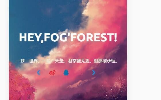
移动端首页信息块显示
<div class="focusinfo"> 该区块存放里有你的信息,在手机端被 display:none 了,所以需要注释掉。
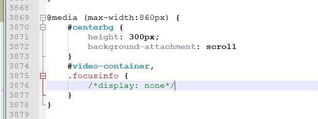
去掉之后还需要美化下样式,加入如下 CSS
/*移动端美化样式*/
@media (max-width:860px) {

    /*cusinfo .header-tou img {
    }移动端的头像样式自己改*/
    .center-text {
        /*移动端文字大小*/
        font-size: 40px;
    }

    .focusinfo .header-info {
        /*移动端首页一句话*/
        display: flex;
        flex-direction: column;
        align-items: center;
        justify-content: center;
        font-size: 15px;
        background: none !important
    }

    .focusinfo .header-info .top-social_v2 {
        /*移动端社交图标*/
        display: flex;
        justify-content: center;
        align-items: center;
        margin: 15px 0px;
    }

    #centerbg {
        /*移动端背景全屏*/
        height: 100vh;
    }
}
预览
Comments | NOTHING